The finishing touches to our Luxury Home Office
Those of you that follow me on instagram may have caught a few shots of our home office in-the-making. You may also know that it has quickly become one of my favourite spaces in our entire house…and not through much planning if I’m honest. So today, as the room is almost complete, I thought I’d talk about the finishing touches to our luxury home office, one of which is inspired by a chair I saw in this vintage furniture range**.
Our Luxury Home Office
The initial plans
The front room of the house, downstairs would have originally been a living room, but as we extended out considerably at the back to create one large open-plan living space (that we now use 95% of the time!), we didn’t feel we needed a separate lounge area. Initially, I thought we might turn it into a sort of snug…somewhere with a big comfy couch, a huge armchair, TV and open fire…somewhere we’d use in the winter and for family films.
But as we’ve lived in the house for over a year now, we’ve realised that at this stage in our family’s life, we don’t really need a space like that.
The need for a luxury home office
As I work for myself (as well as this blog, my business is WeBlogNorth and the Northern Blog Awards, if you’re interested), I predominantly work from home on either our desktop or my laptop. Since moving in, this has been from the dining table in the middle of our living space. This quickly became impractical, as I like A LOT of stationery, keep notes and post-its everywhere and totally took over our dining space. It also meant that the room always looks a little bit messy (no hiding it as it’s open plan) and that every time we had guests, we had to clear the dining table and pile-up my work in the corner. Not a practical solution by any stretch.
So we both agreed that I was in need of a home office and since I rarely get time away from being a mum, it should feel luxurious and a space where I could close the door and escape.
The design of my luxury home office
This room was left ’til last, as in honesty, it became a dumping ground for all the boxes we hadn’t sorted through and the pieces of furniture we hadn’t found a place for yet in the house. We used to just shut the door and pretend it wasn’t all there…it was my Monica Cupboard!
But, one week, the in-laws came over and seeing me heavily pregnant, working at the dining table amongst the mess, decided to help by clearing the entire room out! When they did, I remembered what potential it had as a space! We also realised that the original floorboards weren’t in as bad a condition as we’d expected them to be and could be salvaged, for the characterful look we wanted.
So fast forward a month and we had our builders sand, stain and matte varnish the existing floorboards (cost us about £500 but so worth it and cheaper than buying in new flooring!) and it was ready to paint!
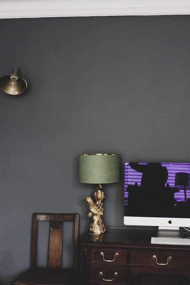
If you head on over to my Home and Interiors board on Pinterest, you’ll see that I’ve been inspired by darker colours and bold interior design. With my hubby being a little less brave than me in terms of interior design, I had kissed goodbye to dreams of a dark, moody and luxurious room in our renovated house. But when I saw the empty front room, drenched in natural light and oozing character from the original floorboards, I threw caution to the wind and decided I’d go dark! (The hubby was too exhausted at this point and just let me get on with it).
I’d always adored Farrow and Ball’s Down pipe paint colour but having been so happy with the B&Q Premium Valspar Paint in the past, we decided to colour match it and I’m so pleased with the results.

The finishing touches
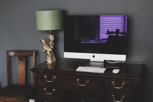
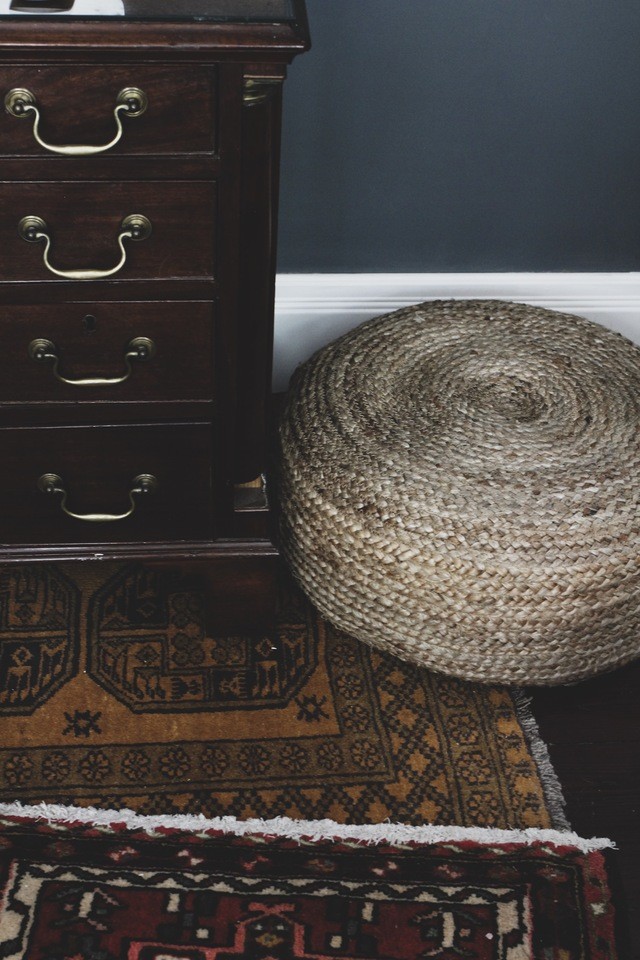
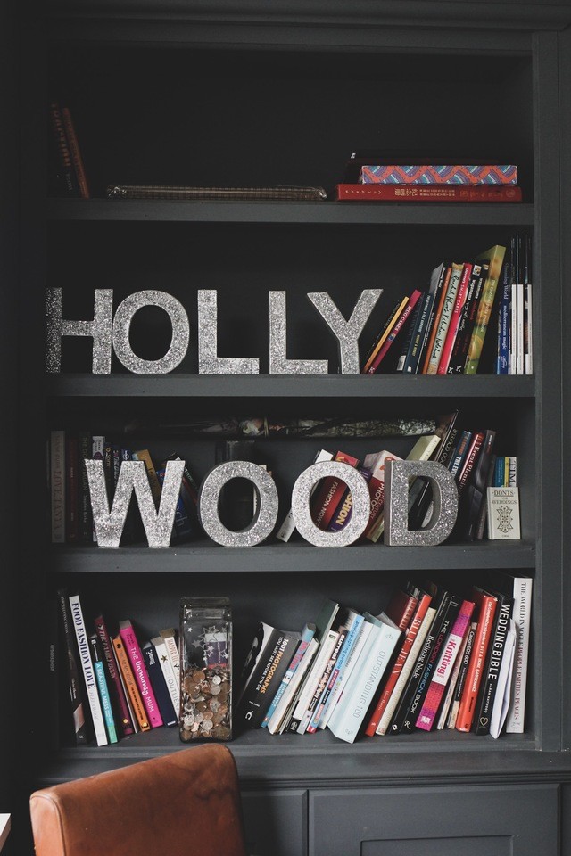
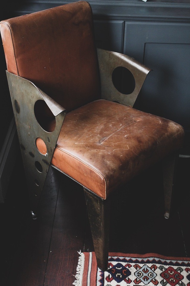
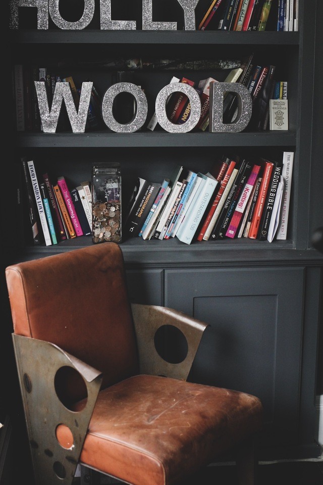
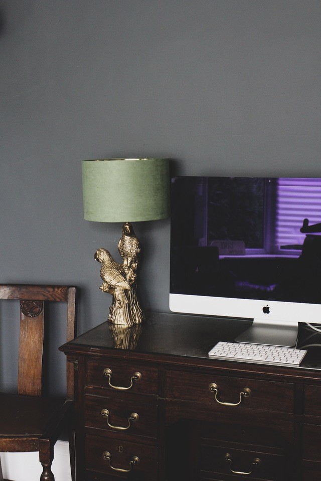
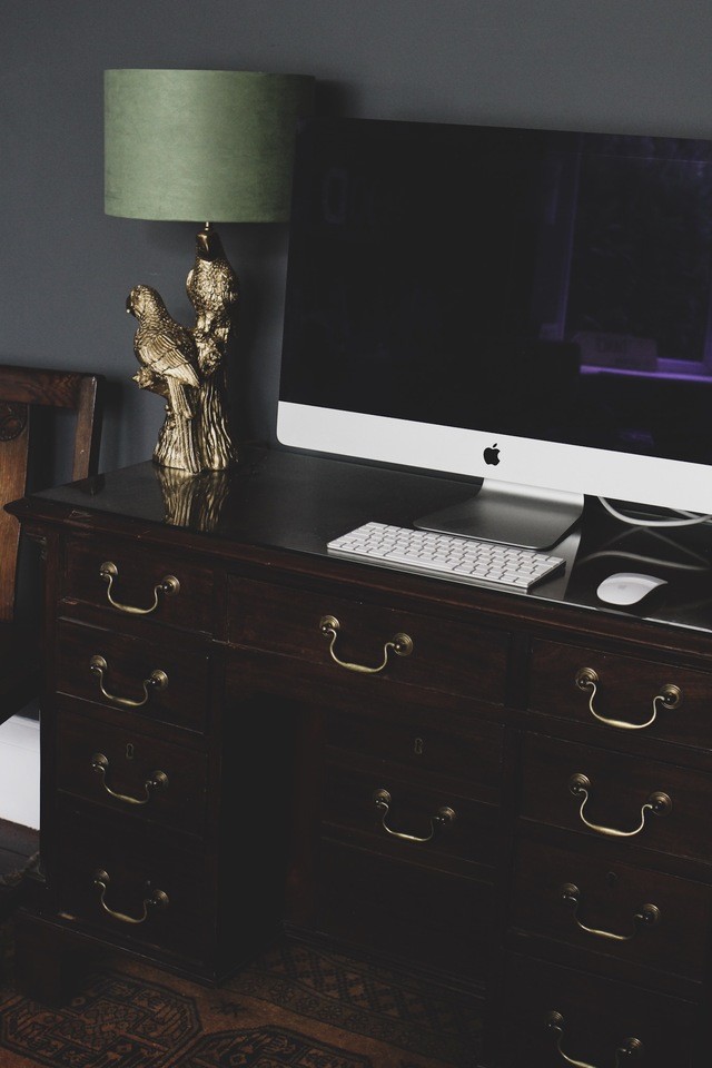
So with the floor sorted, shelves built (we also got our builders to do this!) and the walls painted, it was now time to select the various pieces of furniture that would work perfectly with the dark colours. One being this amazing antique desk and another being my one-off art-deco inspired leather chair (we have a pair!).
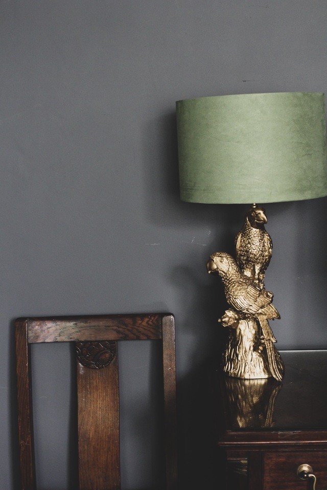
To add a pop of colour to the room, we’ve introduced brass and gold features, including this amazing Parrot lamp from Dunelm and I love the texture of green velvet from the lampshade too.
But I feel like something’s missing and this is where I come back to the vintage leather club chair I mention at the beginning of my post…I need a comfy reading chair to put in the bay window. A space where I can sit and write notes in my moleskine or flick through Pinterest on my phone (uninterrupted by the kids!). And I think something like this chair would be perfect, don’t you?
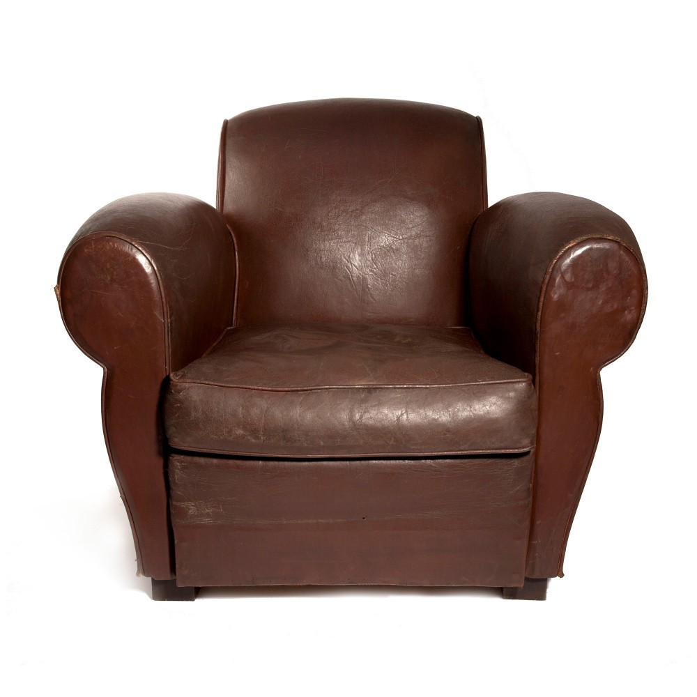
**this post is written in collaboration with Soho Home. However, I genuinely love their furniture and really really want this vintage leather club chair, so wouldn’t write about it if that wasn’t the case.
