Bathroom Redesign – Progress
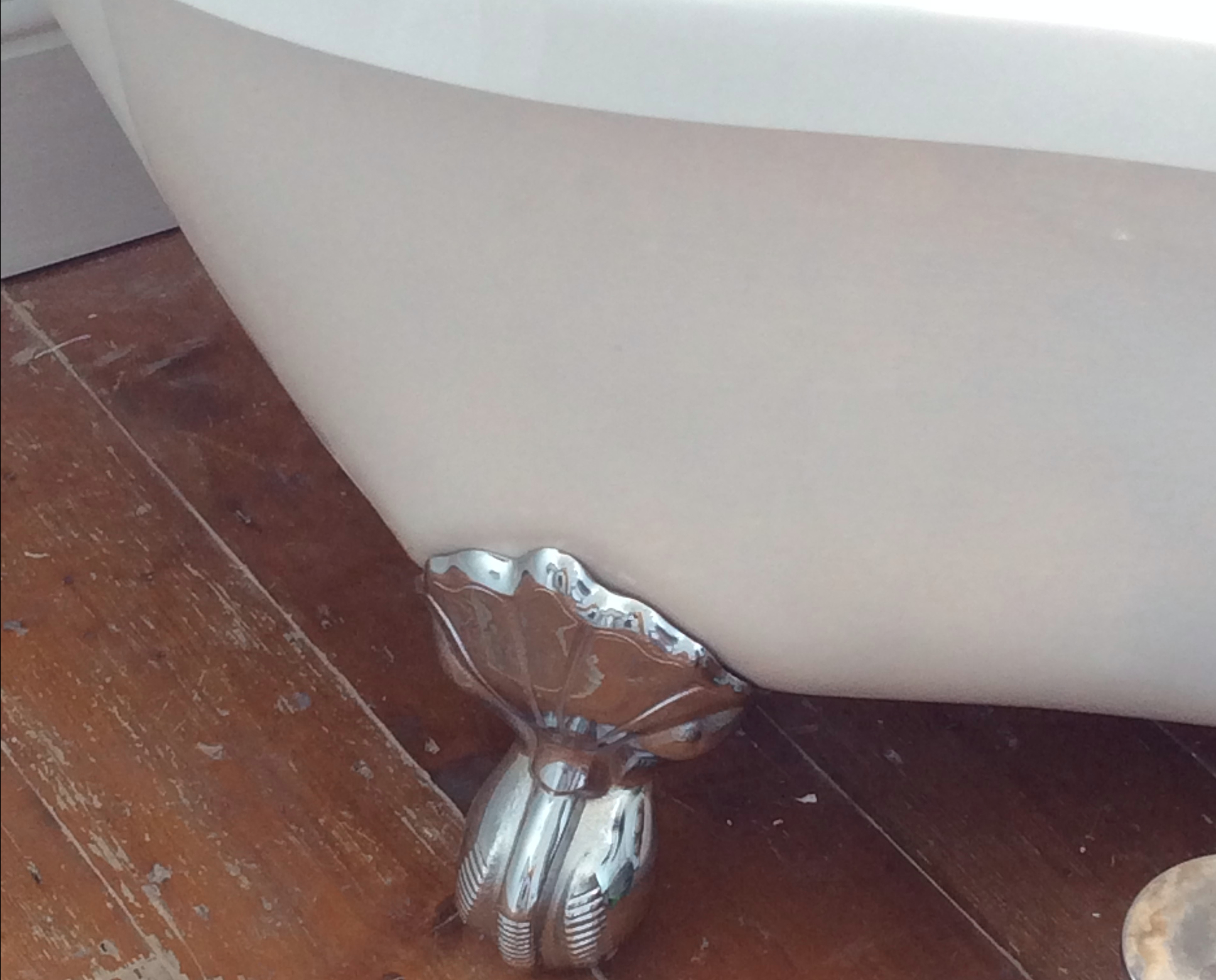
We’ve been working on doing-up our Victorian Terraced house slowly but surely since we bought it 6 months ago and one of our main priorities was the bathroom redesign.
We adore our house and everything is well-scaled and decently sized…except the bathroom – which was bloody tiny! It was at the top of the stairs, in a small cupboard room off to the right and literally was big enough to stand up in and nothing much else. There was a bath, with shower over, a toilet which was pushed right up to the bath (so your legs would be touching the bath when you sat down on it) and then a sink right next to that. No room to get changed in there or have any storage.
You can see the floorplan of our house to give you an idea of what I mean.
We want the house to function well for us now. We want to enjoy living in it as we want to, not as how we think we should. And as we have 3 bedrooms and don’t really need the 3rd for now, we decided that we’d move the tiny bathroom and relocate it into the 3rd bedroom – making a larger, more luxury feel room. The ex-bathroom would then become a utility room with laundry and storage space. And if we ever decide we need the 3rd bedroom, we’d go up into the attic space or down into the cellar. So it’s been a no-brainer for us.
Now onto the design…we both love the fact that we live in a Victorian house that still has some of its original features, so wanted to be sympathetic to that with the design. So roll-top baths, Victorian-style sink and toilet and wooden floor-boards were order of the day. Anything modern or contemporary would be classic, chrome and off-set the more traditional items well. We also wanted a splash of colour in this room as…why the hell not?!
But although larger than the original bathroom, the room still isn’t huge! Approx 3m x 2.5m I’d say. So it was a bit of a task when we were working out how we’d fit everything we wanted into there and still allow enough space to actually move, which was the whole point of relocating the bathroom in the first place.
So some clever planning and lots of searching resulted in a well proportioned and spaced room.
I’ll be writing a separate post once everything is finished that details the fittings and fixtures with finished shots, but for now, here’s a sneak peak!
Here’s the room gutted…was hard to imagine how it’d ever look like a bathroom at this point!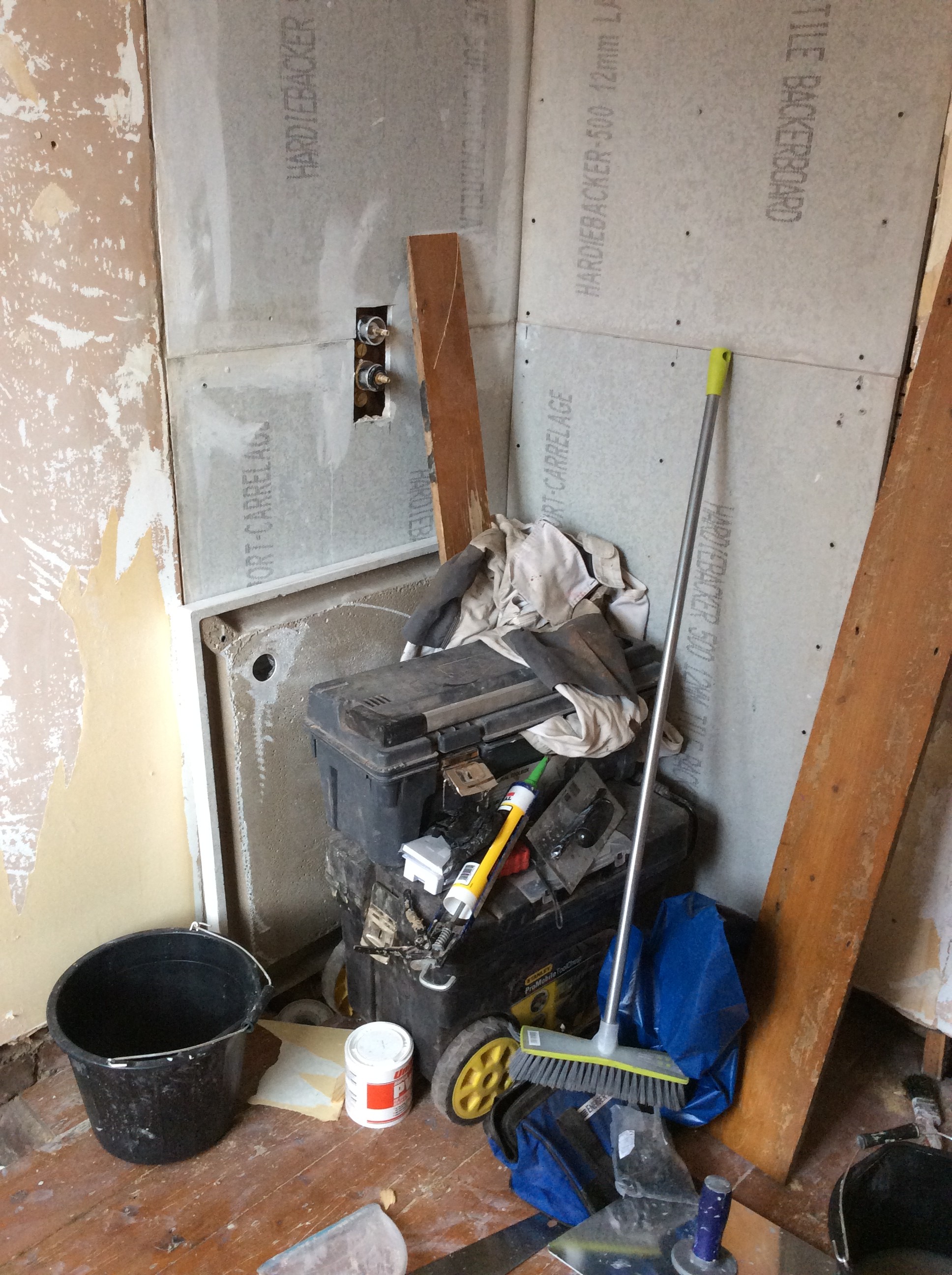
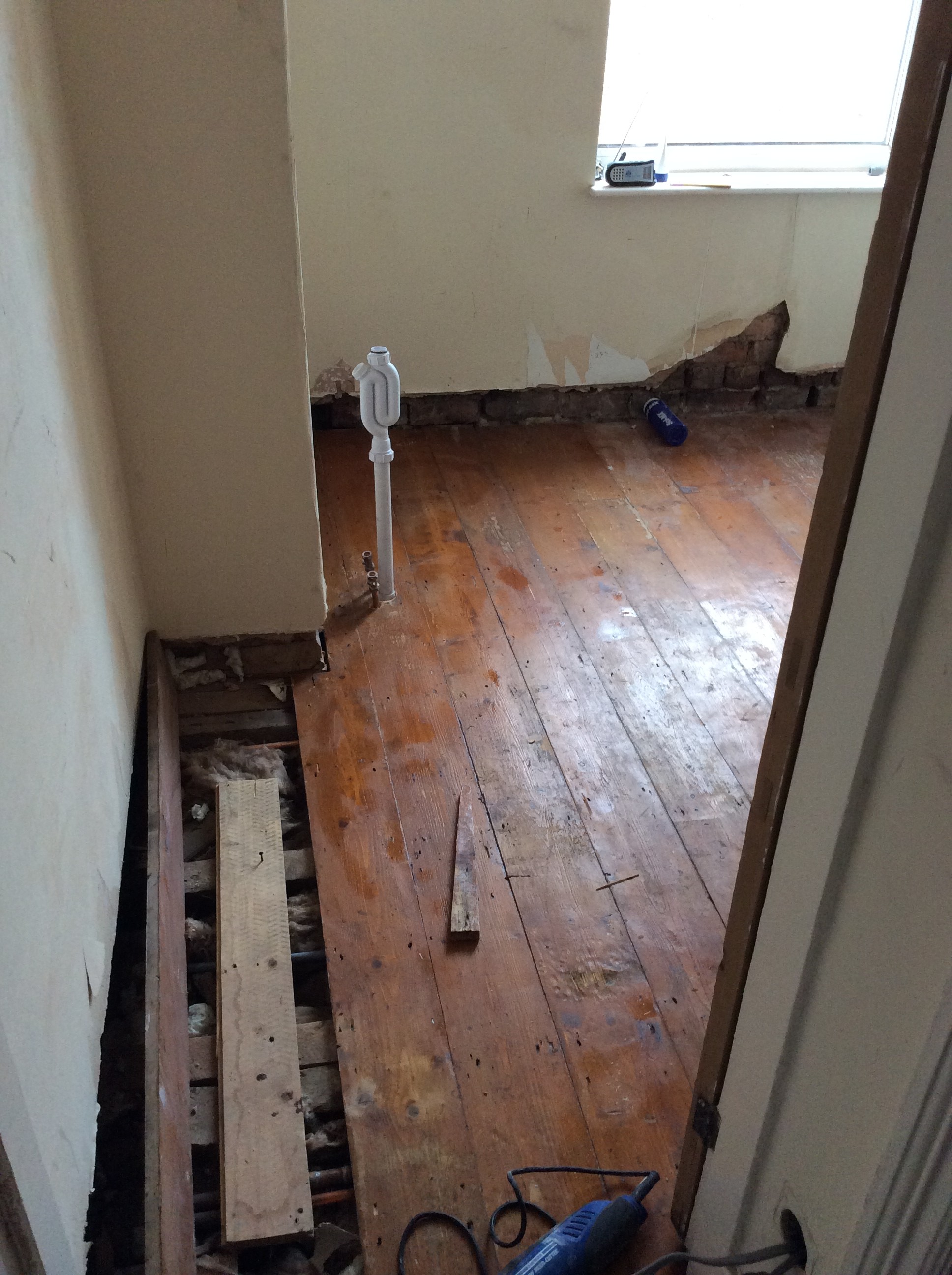
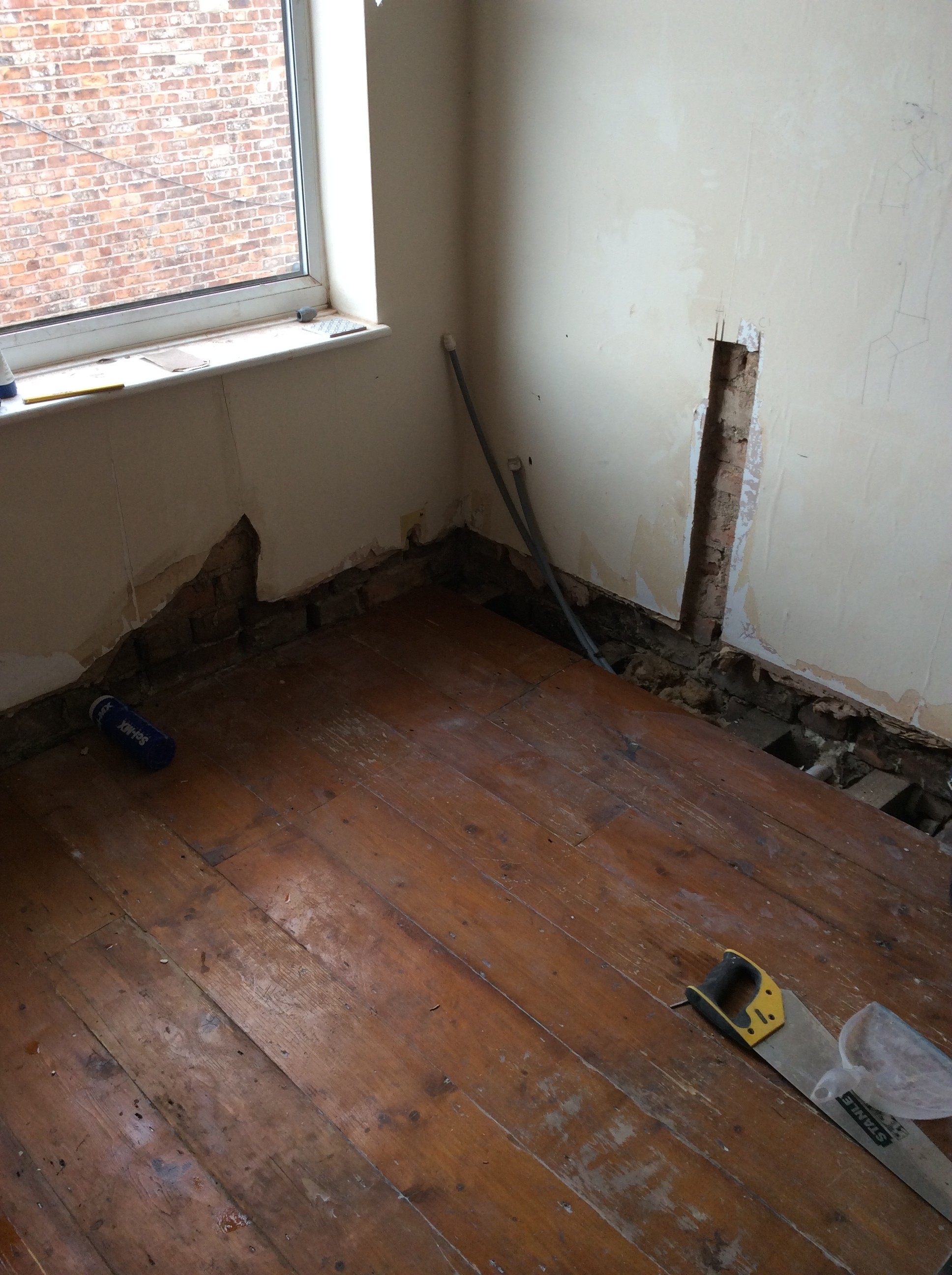
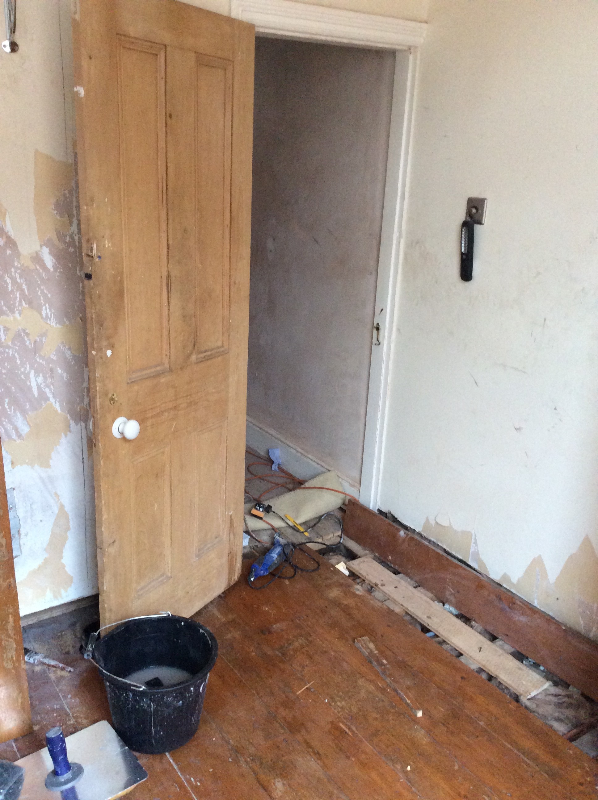
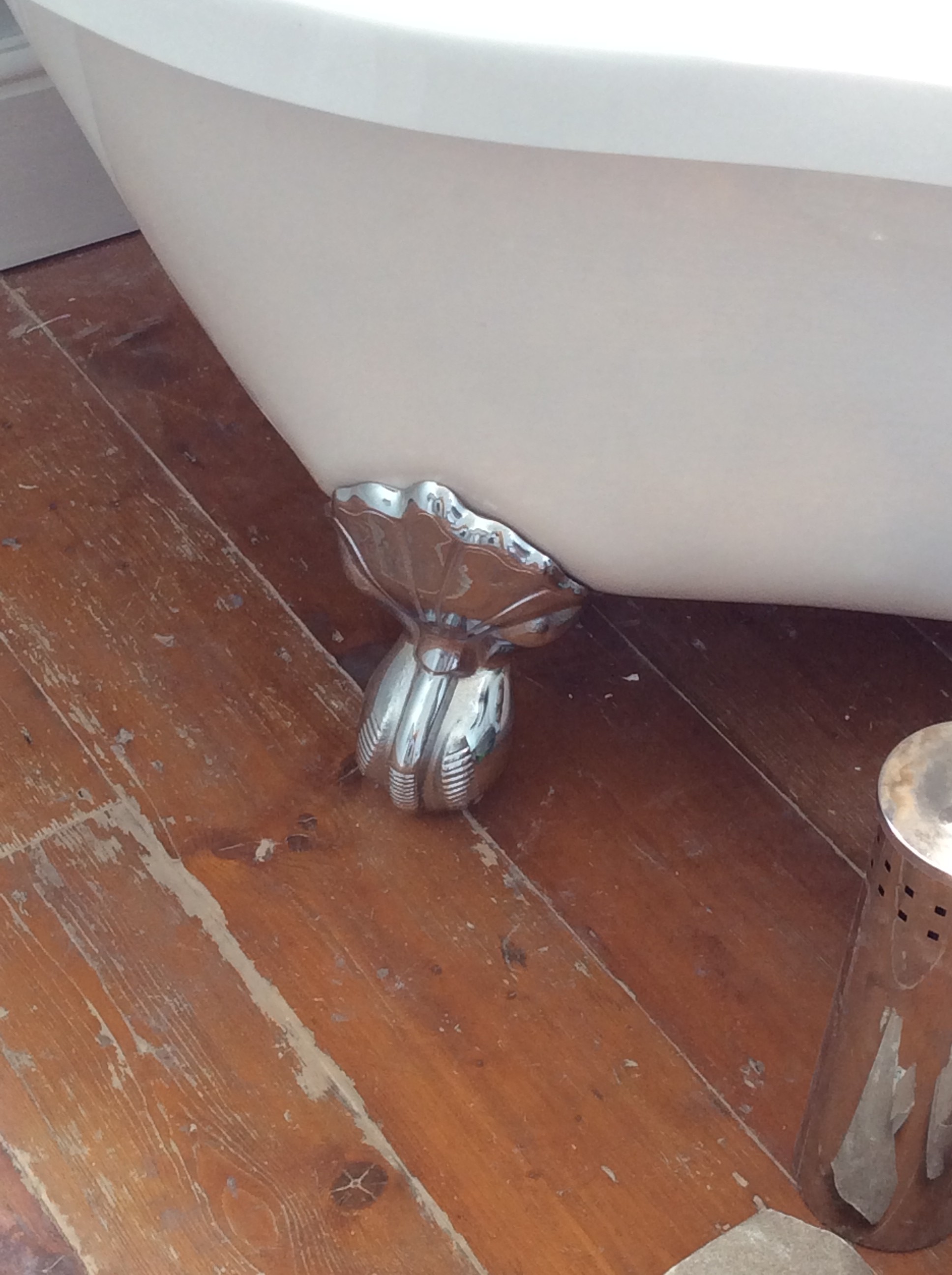
We pulled up the carpet in the room and the floor-boards underneath were a mess, most weren’t original and they were all different sizes. So the ones you can see in the pictures above are the reclaimed ones we found on eBay. We were really lucky and found someone within 30mins drive that had gutted his Victorian living room and there was plenty of floor-boards to choose from. It was well worth it, as keeps that original, authentic feel of the property.
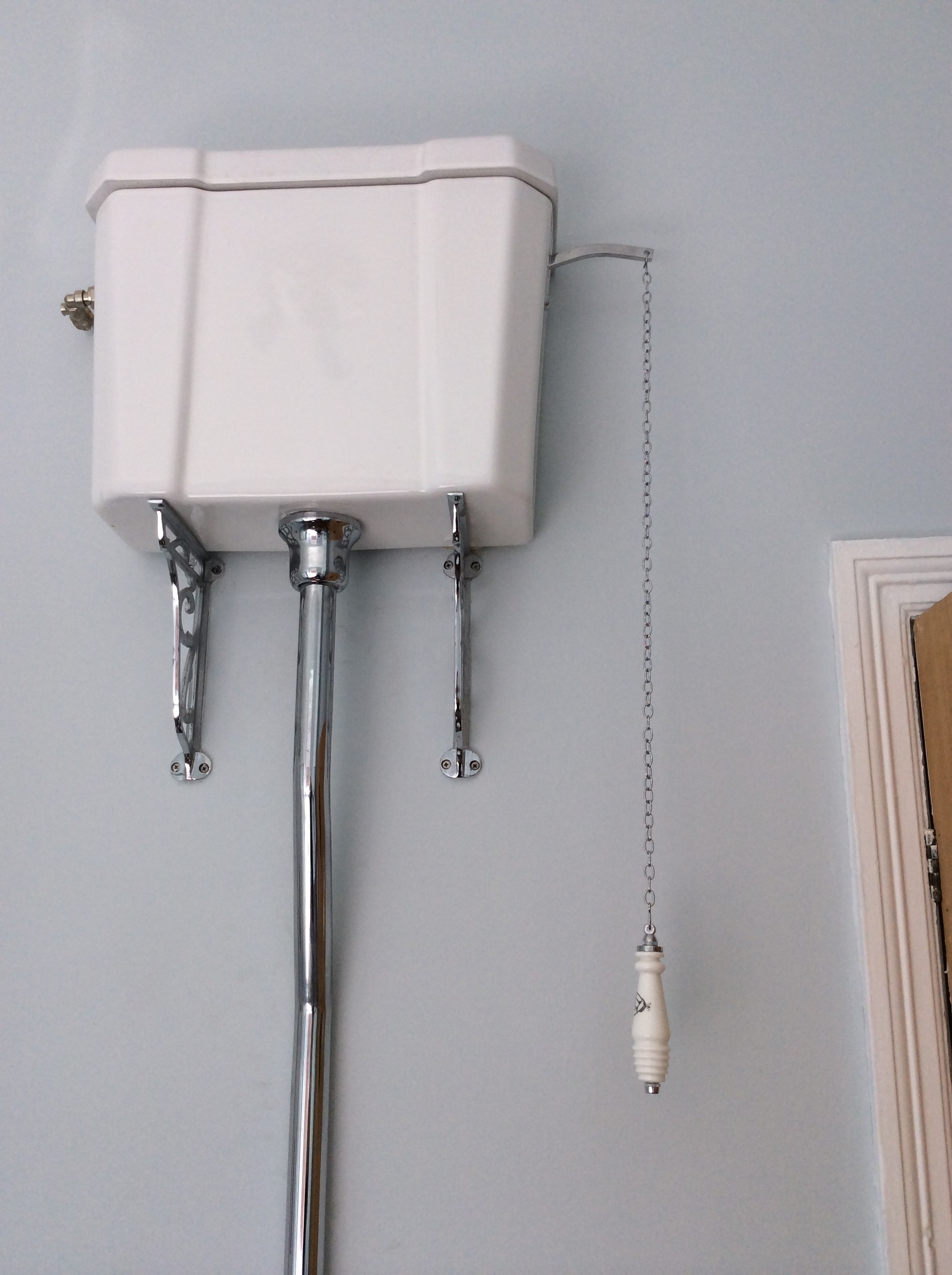
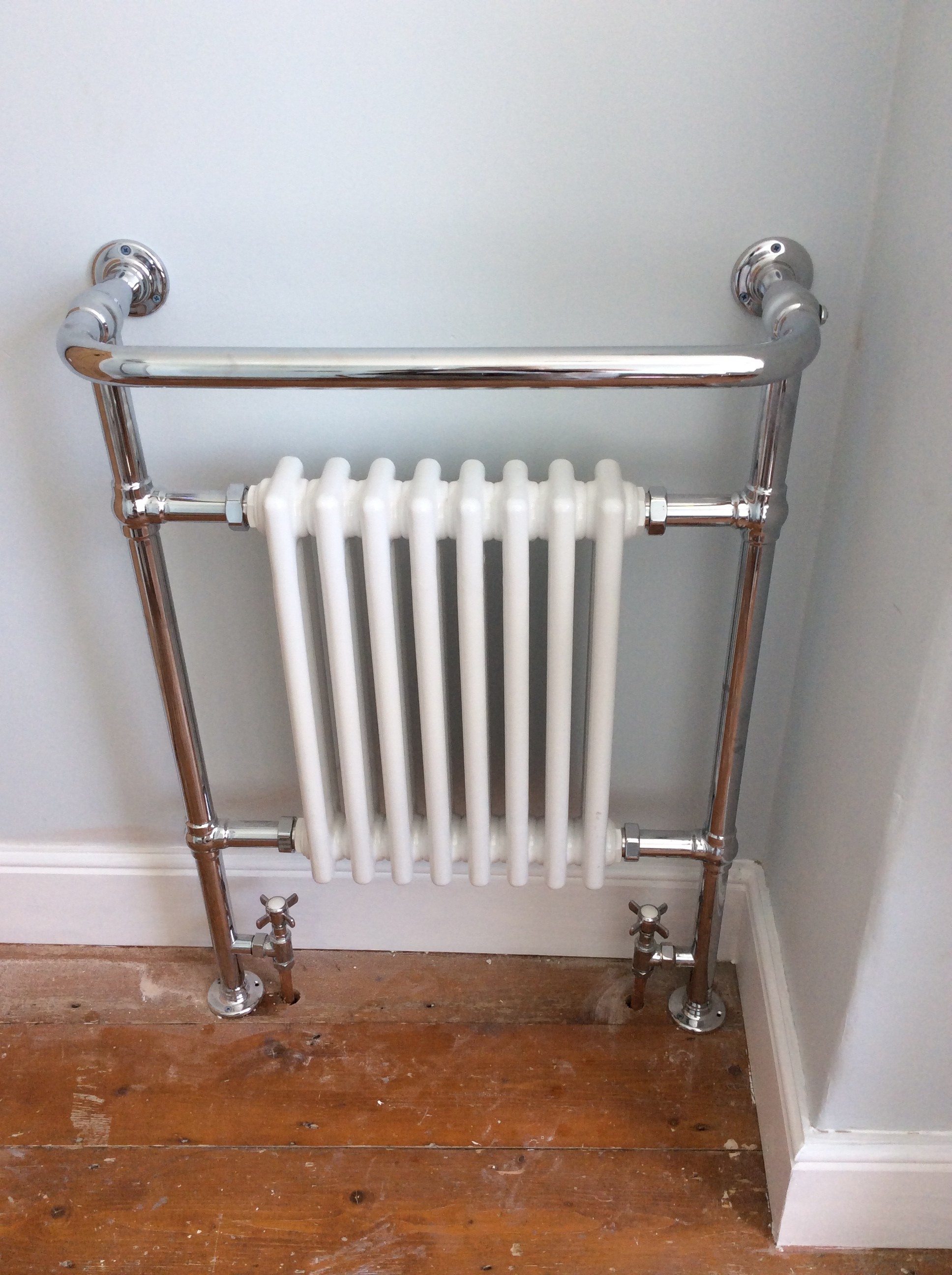
And here’s a sneak peak of the Victorian-style fittings we went for…
You’ve also got a preview of the colour we went for on the walls 🙂
So there’s your progress shots of our bathroom redesign, along with a few sneak peaks. Keep your eyes peeled for the post of the finished product, which will be coming in the next few weeks.
Are you redesigning your house? Tell me about it here…
[mc-sign-up-list]
