Kitchen Redesign – House and Home Series – Part 2
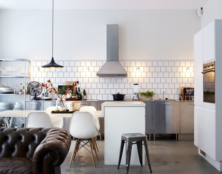
Continuing the House and Home Series, we’re concentrating on our kitchen redesign at the moment.
Although we had a decent sized kitchen in our last apartment, it opened onto the lounge, so didn’t feel like its own space. It was also purpose built for the apartments and didn’t really have any character. So when we bought this house, we were very excited about having a separate kitchen and although not huge, it’s a great size for a house of this type and plenty of room to do what we want. As we have a separate dining room, we also don’t have to worry about fitting a table in the kitchen itself.
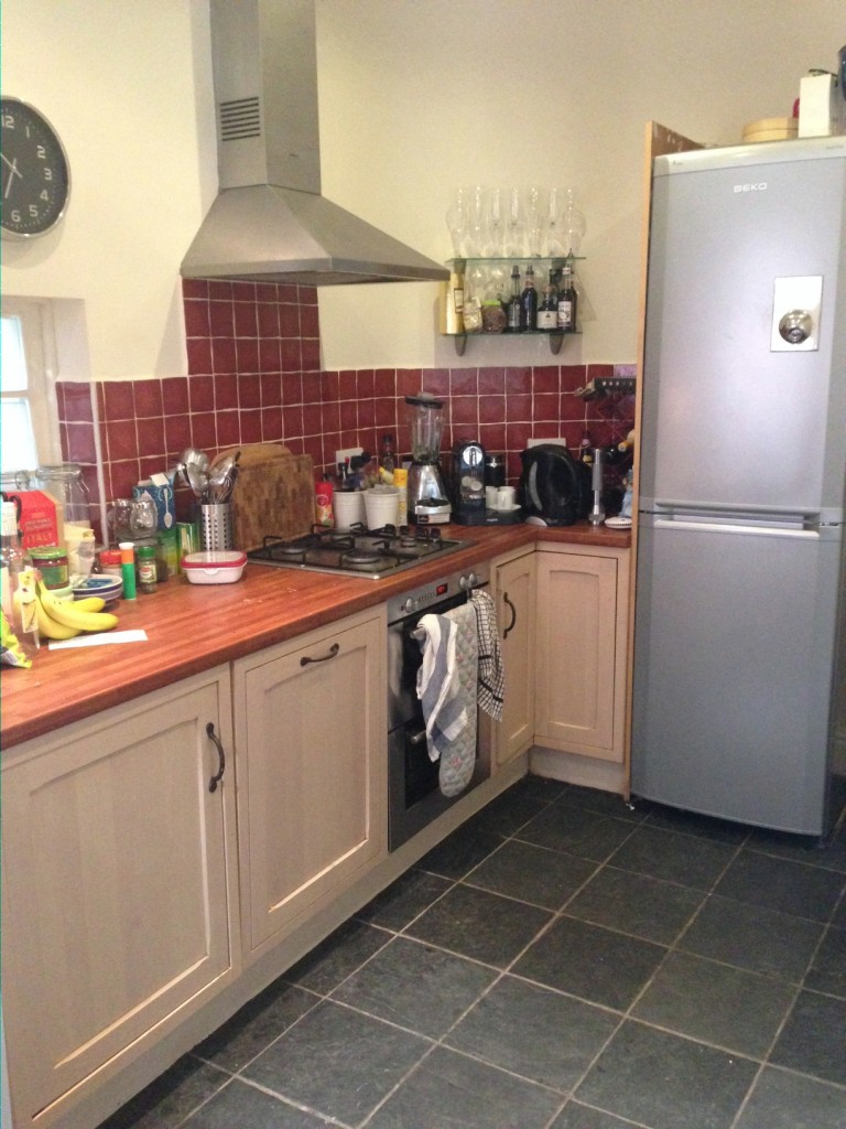
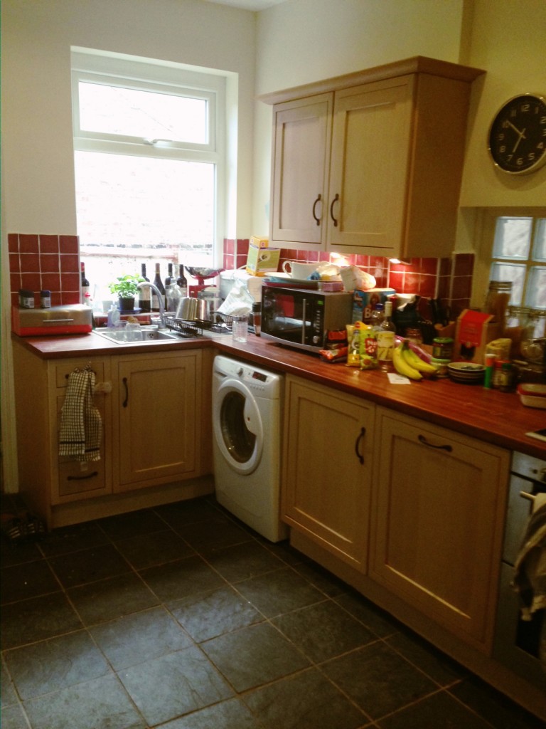
The kitchen that’s in situ at the moment is totally fine and clearly wasn’t installed all that long ago. But it’s not our taste and doesn’t make the most of the space. It seems quite dark in there and the red tiles enclose the space a bit. There’s also not that much cupboard space, which was one of the first things we realised when we actually moved in and started using the space. Essentially it’s okay and we don’t want just okay.
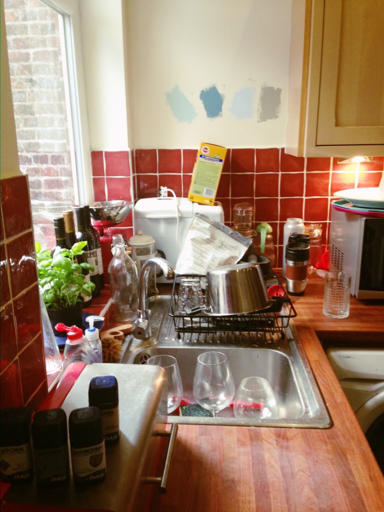
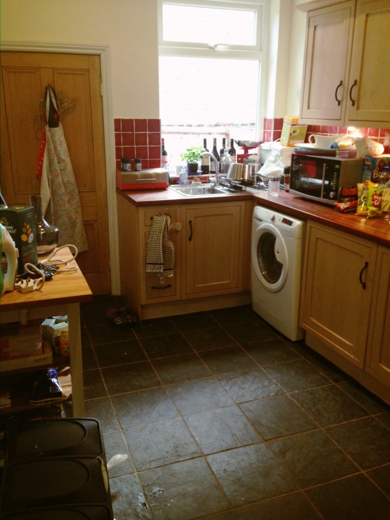
Here’s the before photos:
Excuse the mess! You can see that there’s a large window above the sink, which we love and lets in lots of light. There’s also some glass bricks along the side wall, which again lets in light. There’s real slate floor tiles, which we will keep and an integrated dish-washer. The counter-tops are currently laminate and a sort of a cherry coloured wood effect. I really don’t like these and find that it’s hard to match with other colours. So we’ve decided to go for real oak tops.
You’ll see in the 3rd photo above, that we’ve been testing a few paint colours. I really like blue and think it suits Victorian properties well. We’re angling towards the “mint” blue colour which is the first one on the left. Think it’s got enough colour to give personality, but won’t detract from everything else that will be going on in the kitchen and also won’t make the space seem smaller (we hope!).
As I’ve mentioned, we don’t like the red tiles and want to go for a white butcher-style tile. Think this keeps it looking fresh and again, should hopefully give the illusion of more space.
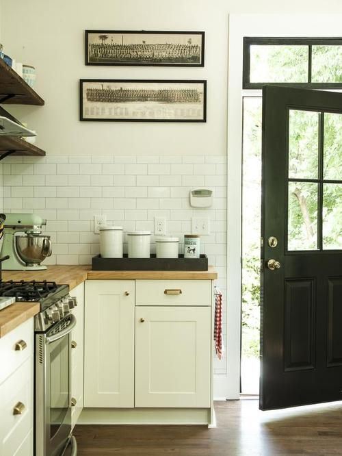
This is the sort of thing we’re thinking of:
Image sourced online from LizMarieBlog
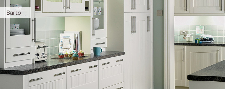
I love the fresh white tiles against the oak tops and light coloured units. These units and counter-top are similar to the ones we went for in the end. We don’t have a huge budget for our kitchen, so wanted to build it up ourselves, rather than have a whole design from a kitchen company (which costs thousands!). We also thought that this would give the eclectic character we wanted. So we chose our kitchen units in the new year sale at Homebase, one of my new favourite shops! We went for the Hygena ‘Barto’ kitchen units, which have a slight “shaker-style” to them, but still look contemporary. We chose which units we wanted and got them for a 3rd of the price.
Here’s the style, which you can find online at Homebase:
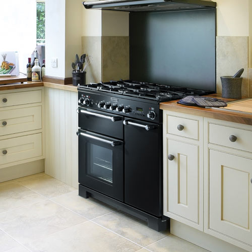
Onto the cooker and dish-washer. We like the idea of the dishwasher being hidden, so asked for it to be integrated. But we wanted more of a wow cooker, to form a focal point of the kitchen. So again, off we head to the sales and opted for a black Rangemaster cooker. It’s larger then what is currently installed and has 5 rings on the hob, so plenty of space to cook. There’s lots of oven space and a separate grill too. We love the look of this and think it’ll sit great against the white tiles, oak counter and light units. We chose a matching black extractor too (but didn’t opt for the splash-back as we’ll have tiles there instead).
Image sourced online at Simon Turner Gas
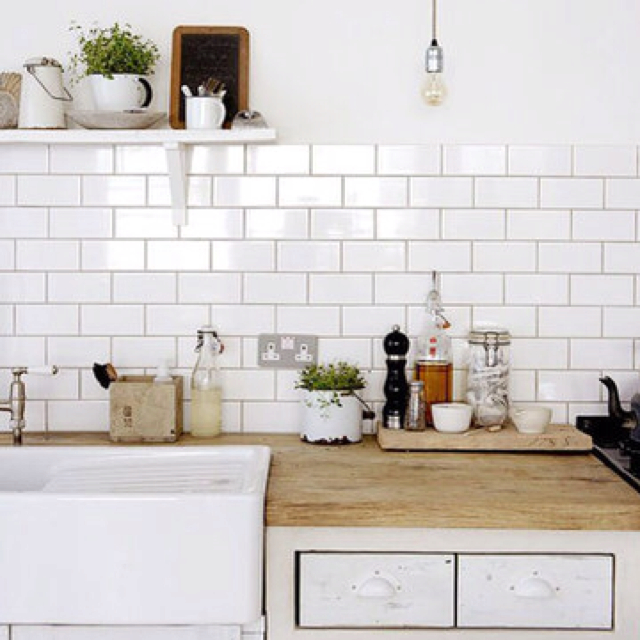
The next big feature we wanted was the sink. We both like white ceramic Butler sinks and the look these give and thought it’d go perfectly with the look we were trying to create:
Image sourced online on Pinterest
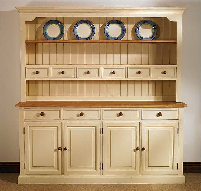
And finally, we feel the wall that runs along the left-hand side of the kitchen is under-utilised. At the moment we’ve got a small free-standing unit there, which we got from Ikea before Christmas just to tide us over. But we ultimately want to put a welsh-dresser there to give even more storage space.
Something like this would work:
Image sourced online
So that’s the general overview of what we’re thinking of for our new kitchen. We’ve ordered the units, countertop and range cooker to arrive in the 2nd week of February. So we’ll crack on then, with the help of my dad and it should all be done by the end of next month. Keep your eyes peeled, as I’ll be posting the finished result on here with lots of before and after photos!
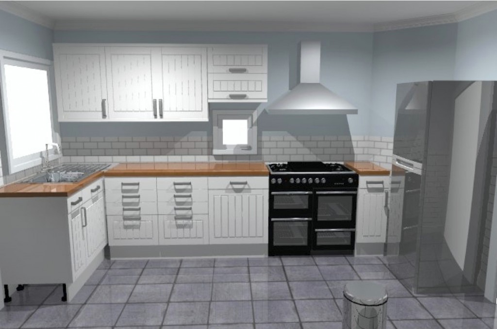
Here’s a general idea of what we think it’ll look like, give or take, which we created online using the Homebase Room Planner (which is a really useful tool by the way and helps you plan your units in advance of going into store):
What do you think?
Don’t forget to check out Part 1 of the House and Home Series. And you can see more of my House and Home inspiration on my Pinterest board.
[mc-sign-up-list]
