The House Project – Before Tour
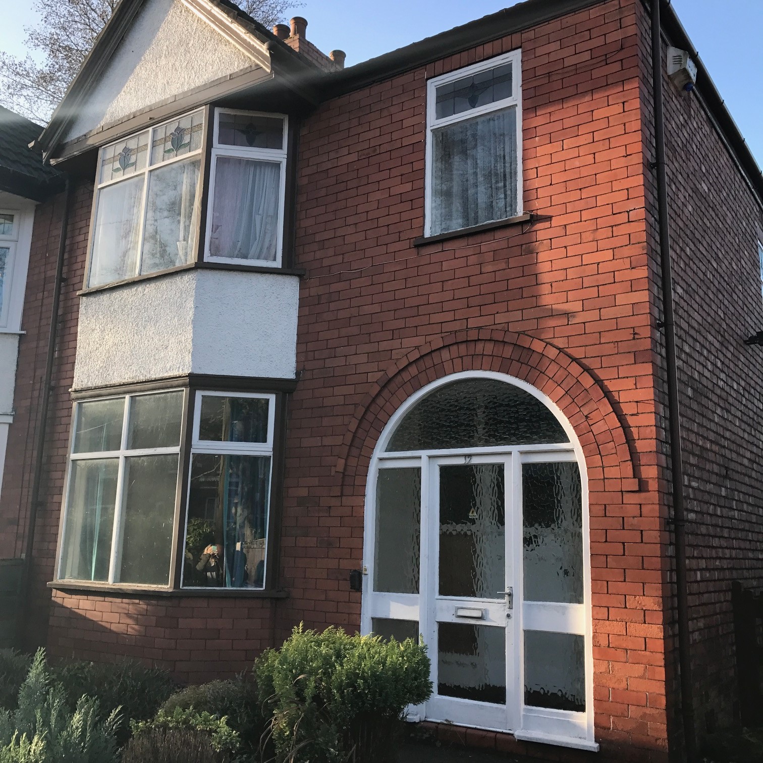
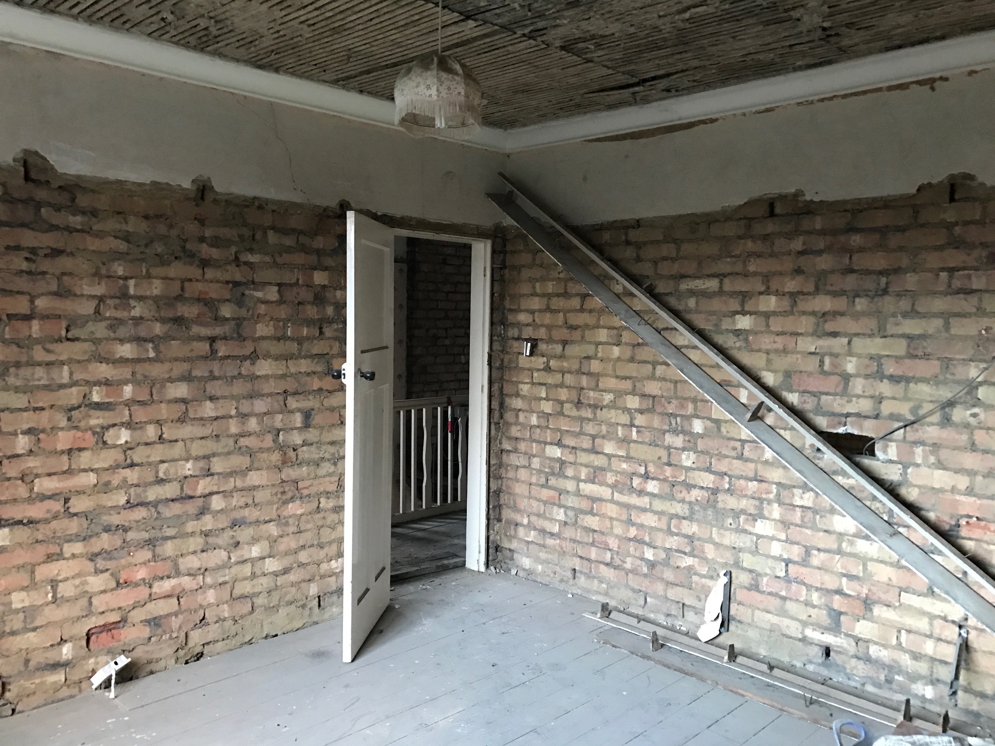
Welcome back to The House Project. As the start of the build is imminent, I thought I better get some before photos and video, so you guys can see exactly what we’re starting with. I thought it’d be a great way to document the whole process so we have our story at the end (hopefully!).
So before I go into more detail, why not grab a cuppa and start with my tour (only takes about 5 minutes)…
The House Project – Before
The house was built in 1928, so although not the Victorian/Edwardian era that we prefer, it has character and is a solid building. It is also built with great proportions; nice wide square rooms (as opposed to the narrow Victorian terraced house we’re in now) and sits on a decent plot of land with a garden (again, something we don’t have now).
When we saw the house, we liked it because of the potential it had to extend, the scale of the rooms and the good sized garden (front and rear). We’re looking forward to having off-street parking, somewhere to sit on a warm summer evening (because they do happen occasionally) and an open-plan living space.
So before I tell you about what we’d like to do to the property, I’ll take you through the house as it stands now…
The Entrance Hall
This might sound strange, but this is probably one of my favourite parts of the whole house. Having lived in a terraced house for 3 years, with a large dog and a baby, the need for a wide hallway that you can turn around in is crucial! I’ve managed for 16 months backing a pram in and out, reaching over to close the front door with the tip of my fingers (gently, so as not to wake the sleeping child) and brushing the walls every time I put my coat on. If there’s more than one person in our current hallway, it feels crowded and forget crowding at the front door to wave the visitors goodbye…just not enough room.
So the new house has a great wide entrance hallway, not huge, but big enough to park-up the buggy, take your coat and shoes off and still be able to do a lunge or two (you know, if you wanted to). And my FAVOURITE thing about it? Those original stained-glass windows – love love love.
We like character in properties, old and new, so will 100% be keeping this doorway and windows. It’s the internal door too, so not a lot we need to do with it, other than a good clean and a lick of paint. On that note – any colour ideas? white? or more of a regency colour (pale grey/green perhaps)? But that’s what The House Project will be about – mixing old and new.
The Front Lounge
This is the first room in the house and is located at the front of the property, overlooking the front garden/drive. It’s pretty much square, which I’m happy about as again, having more space in the middle of the room for a toddler to play/crawl about is much needed. It has a great set of bay windows and a period fireplace. It still has it’s original cornice and skirting boards too. This will remain a lounge/snug room – somewhere to cosy-up in front of the telly and just chill-out. It’s also going to be the room that you can close the door to the rest of the house (for those much needed moments of “quiet”).
The Dining Room
This is a really great sized room and I guess would be most people’s dining rooms. It seems to have been used that way by the previous owner. For us, we don’t really need or want a formal dining room – something that’s closed-off from the rest of the house and only gets used a handful of times throughout the year. Instead this will form the first part of the extended open-plan living space (more on that in posts to come).
The Morning Room & Kitchen
We don’t really have a use for morning rooms in modern family life, I don’t think. It would have originally been used to sit and have breakfast or a cup of coffee and ours is located just off the kitchen and leads through to the entrance hallway. It also houses the side door, taking you out the side of the house and round to the garden.
When we first saw the house, it seemed such a wasted space, with great light and immediately we knew there’d have to be some walls knocking-down. So that’s part of the plan…
The kitchen in The House Project seems a bit of an after-thought. It’s in an extension that sticks out from the back of the house and is only half the width of the house. So it’s narrow and separate from the rest of the living space. Definitely not the way it’ll be once we’ve completed the renovation. It looks over the garden and the front of the garage (which will be demolished).
Upstairs
Again, we’re super excited to have a wider staircase, as we didn’t quite realise how tough maneuvering furniture (and in fact anything) up and down the narrow Victorian terraced staircase would be, when we moved in. Of course we’ve managed, but we are excited about a wider, bending staircase. Feels so grown-up. And it’s got THAT window. That’s staying for sure!
There’s a decent sized landing which all of the bedrooms and the bathroom lead off of.
The 3rd bedroom, the smallest room of The House Project, is a bit of a box room and our renovation plans mean it’ll be even smaller when we’re finished. But it’ll be the baby’s room and eventually a study I think.
The Master bedroom sits at the front of the house and benefits from another amazing bay window with original stained-glass.
The second bedroom is a great size, with a large window that overlooks the garden. We’re really excited about having a proper guest bedroom once The House Project is over. We love to have people to stay and it’ll be great to have a room that’s always set-up as a bedroom. How should we decorate this one? I’ve got so many ideas…
The bathroom & WC are currently separate, which personally, I don’t like. I like a bit of space when I’m on the loo (sorry) and think with a toddler who’s about to start potty training, I’ll need all the space I can get. So we’ll be knocking the two spaces through into each other, to have a larger family bathroom, that’ll have a door right off the top of the staircase. I like to have a feeling of luxury on the rare occasion I can indulge in a bath, so that’ll be the overriding theme for this part of the renovation.
The Garden
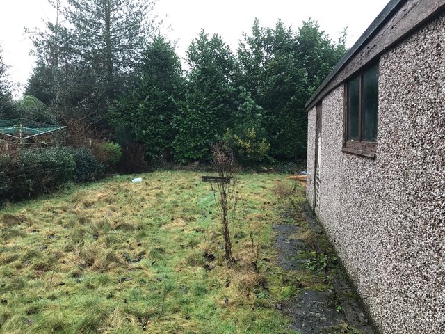
With a large dog and a walking toddler, this is probably the most NEEDED of all the things in The House Project. We have a small yard at the moment, which after having lived in a 3rd floor apartment with no balcony, was a much needed outside space. But it’s quickly become full of all of the things we can’t fit in the house and once there’s a few of us out there for a BBQ, it feels claustrophobic and clumsy. It was great as a couple, but as a growing family, not so much.
So we’re looking forward to spending a lot of time in the garden: throwing a ball for the dog, running around playing games and lounging with a glass of wine in the summer months.
It’s important the outdoors and the living space are integrated and flow naturally – so that’s forming the basis of our extension plans. More on that soon.
So there we have it – the before tour!
In the next few posts I’ll be taking you through some of the practical points of taking on a renovation project, along with some key tips in case you embark on something like this yourself. I’ll also be moving onto showing you the plans and then the design inspo for each room. That’s where it gets fun!
If you didn’t see the intro, check it out now and keep your eyes peeled here, for more updates on The House Project.
Who else is undergoing a project like this? Any tips you’ve found out along the way?
[mc-sign-up-list]
