Our Blue Kitchen – A House Project Update
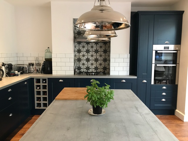
It’s been a little while since I’ve posted anything about our home renovation on here, mainly because we’ve been busy in Italy and with work and certainly not because the work has stopped! In fact, 6 months into our total home renovation, we’ve still got plenty of work to do! But one of the spaces that is 95% complete is our lovely blue kitchen.
So I thought now would be a good time to reveal the new look of our kitchen space and talk a little bit about how we got there and which suppliers and brands we’ve used. So grab a cuppa, put the House & Garden magazine down and have a read…
A Blue Kitchen I hear you ask!
One of the first decisions we made with our renovation project was the kitchen. We knew what style we wanted, how we wanted to use the space and most significantly, what colour we wanted the kitchen units to be. In the year leading up to buying the house, I had been drooling over Pinterest and interiors magazines and the something that I had spotted time and time again and loved, was the blue kitchen. To me, dark blue units made open-plan kitchens a feature in themselves. I particularly liked them against a white backdrop and with concrete work-tops.
So even when we hadn’t chosen everything else, we knew we were on the hunt of a blue kitchen! And when we were shopping for one, there weren’t many around on the high-street. We didn’t have the budget to pay for a £30,000 bespoke spray-painted kitchen and on the high-street our colour options were limited. Then we found Wren…
A Wren Kitchen
I hadn’t done much research on Wren before, though I had heard of them and when I went online, I was impressed by the styles and colours of kitchen units they had on offer, at more reasonable prices. I instantly fell in love with the Shaker Baltic Matt style and we made an appointment to go and see it in person and get a quote. I’ve talked more about the design-process in a post here, so won’t bore you with the details, but I found the sales team very helpful and accommodating.
We were savvy in ordering our kitchen in the Christmas sales (actually before we’d even had plans signed-off on the house!), so got the best deal we could and found that we had a large, impressive kitchen on order, for a very reasonable price!
Installation – FYI, for Wren to fit our kitchen was quite a significant amount (nearly half the cost of our kitchen), we we had our builders fit it. Just a bit of advice!
What We Chose
So with the colour chosen and our house plans drawn, we had to work out what units we wanted, integrated appliances and fixtures and fittings. Now I’m not ashamed to say that absolutely top of my list, was an integrated wine fridge! Second on my list was an integrated wine rack (there’s a theme here!) and then third on my list was a standing height oven.
That, along with the kitchen island were my must-haves and so we basically built the kitchen around these things.
I’d decided that I didn’t want any wall-units, as I felt it would make the space feel claustrophobic and dark. Instead we wanted to pack as many units into the floor-standing and kitchen island and then if we found we needed more storage, we’d look into open shelving of some description.
I also prefer drawers over cupboards in general, as I find them easier to use and navigate my way round. So we had plenty of large, deep drawers in our kitchen for pots and pans and everything else. Then a pull out larder cabinet caught my eye and I thought this would be a perfect space to store all our spices, flour and baking bits etc.
We opted for just a hob-top in the chimney breast and a oven at standing heigh, as well as a ceramic sink (as a butler one didn’t quite work), a dishwasher and wine fridge. These were the appliances we chose with Wren.
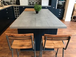
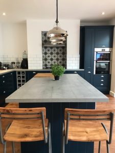
The counter-tops – Now the dream was to have concrete but we couldn’t find anyone to make them for us that didn’t cost a small fortune and although our builder’s were up for giving it a go, it would have been a risk with the kitchen units, if they couldn’t support the concrete. Plus, the budget was running out rapidly. So although I REALLY didn’t want laminate, I spotted a concrete-style laminate in Wren that I thought could be a great compromise – it’s called Concrete Oak and has a sort of grain running through it and doesn’t look fake and plastic-y.
Now onto what the kitchen looked like when we started and what it looks like now…
Before Pics
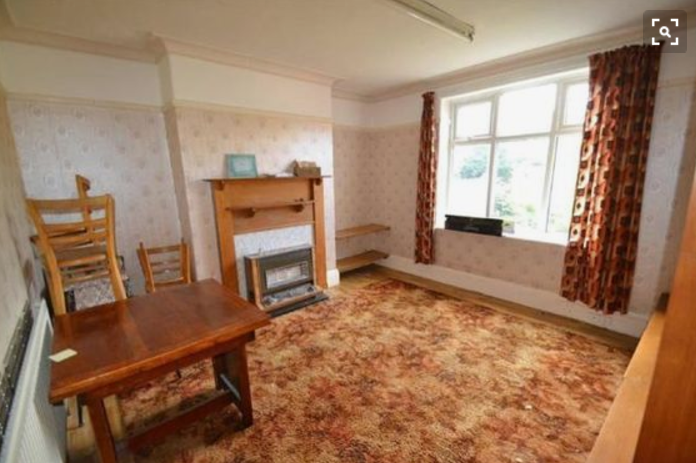
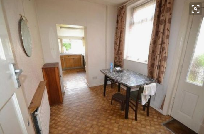
This is the space that we converted into our new open plan blue kitchen. In the original house layout, it was the second reception room (which the previous owner used as a dining room) and the morning room (which was a sort of wasted space, that lead into a small lean-to kitchen sticking out the back of the house).
Because we knew we’d be opening up the whole of this space by knocking down walls and extending approx 3m out into the garden, we realised that this would be the darkest part of the house and the ideal space for our kitchen. We could have the large open-plan kitchen we dreamed-of, with a central island, looking out onto our new extension and garden.
The Design
Once we had our house plans drawn-up and measurements taken properly, Wren mocked-up what our chosen blue kitchen would look like (this happened on a second visit instore). It was fantastic to finally be able to visualise it in the space!
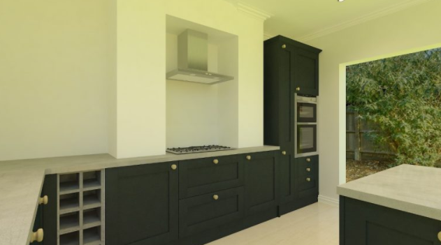
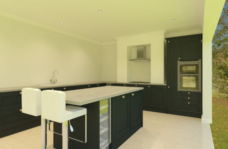
As a point of reference – you can see the chimney breast that used to house the gas fire, has been knocked-out to house the cooker/hob top.
The Finished Result
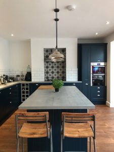
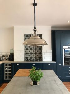
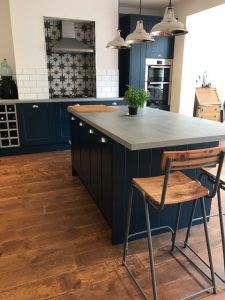
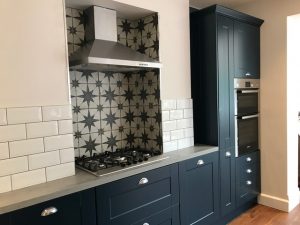
And, the bit that you’ve all been waiting for…what our new blue kitchen actually looks like in real life! Dun dun duuuuuun…
Click the photos to flick through and enlarge.
We’re so happy with the finished result and it’s exactly what we wanted. The space, the units and the colour! Our blue kitchen is the kitchen of our dreams. Even the counter-tops exceeded our expectations and we love it! It cost a tenth of the cost of having real concrete and gives the look and feel we were hoping for.
The Finishing Touches
There are some really key purchases that we made that I feel put our stamp on our new kitchen. Those being: the tiles, the stools and the lighting.
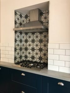
The Tiles – I wanted to make a feature of the inset cooker/hob-top and introduce a bit of depth and interest into the open-plan space. I found these tiles online and loved them instantly. In fact we loved them so much once they were fitted that we decided to have them on the floor in our entrance hall too!
The Stools – I saw these school-chair-style stools on fellow blogger Simply The Nest ‘s instagram and totally loved them and stole her idea 😉 They’re from Rockett St George, which is quick becoming one of my favourite interiors and furniture shops!
The Lighting – So our pièce de résistance, is the lighting we have over our kitchen island. We wanted lighting that would become a design feature in itself, as well as give ambient light in the evenings and when sat at the island. We love the industrial style lighting that is very popular these days but couldn’t find anything quite right. After a bit of searching, I discovered the fabulous Northern company, Urban Cottage Industries, who offer the opportunity to make your factorylux lighting totally bespoke. You essentially build the perfect light fixture for you. You choose the lamp shade, the size, the colour, the finish, the holder, the ceiling rose, the bulbs and even the colour of the cable that hangs from the ceiling. It’s amazing!
We went for the Coolicon shade in retro silver with a navy blue fabric cable to match our kitchen units. We have three directly over our island and we LOVE them! What’s more, this type of pendant light can be ordered online, totally bespoke, for next day delivery! Go go go!
In conclusion…
Our blue kitchen is the stuff our dreams were made of and it’s been an exciting and rewarding process seeing it come together. Although nearly complete, we’d still like to style it out a bit and add some personal touches to make it perfect. Any suggestions or advice, totally welcome!
