Kitchen Tiles Inspiration – The House Project
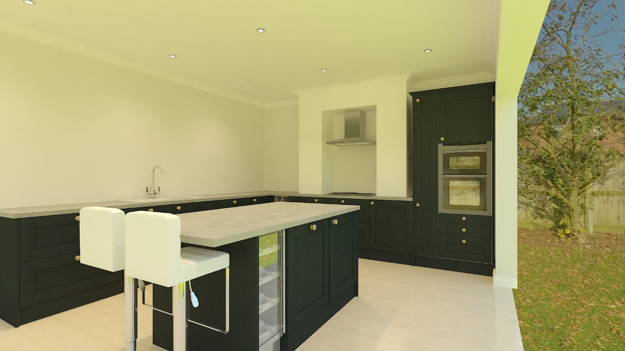
You may have seen yesterday’s post on our new kitchen design for the House Project and I’m catching-up with myself after a busy couple of months and working out how we should tile the kitchen itself. So I quickly got excited about the styling side of things and pulled together some kitchen tiles inspiration…
Let me know what you think!
Kitchen Tiles Inspiration
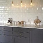
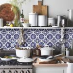
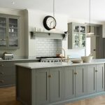
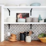
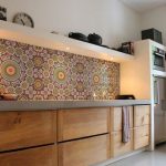
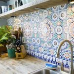
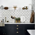
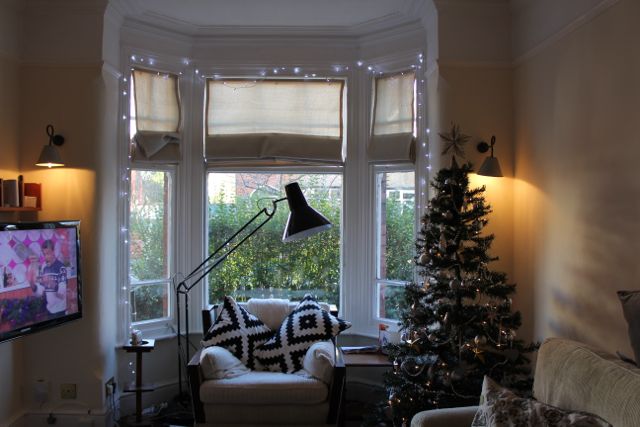
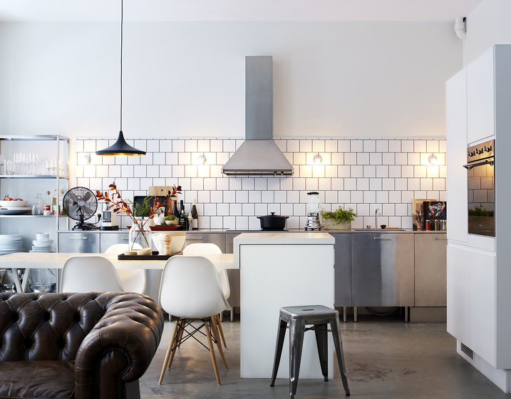
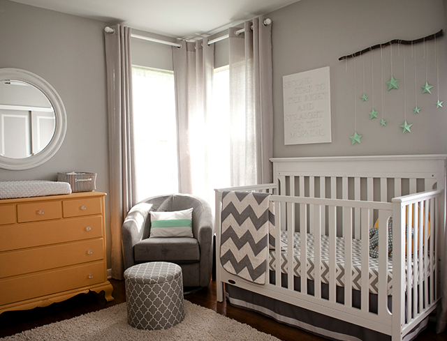
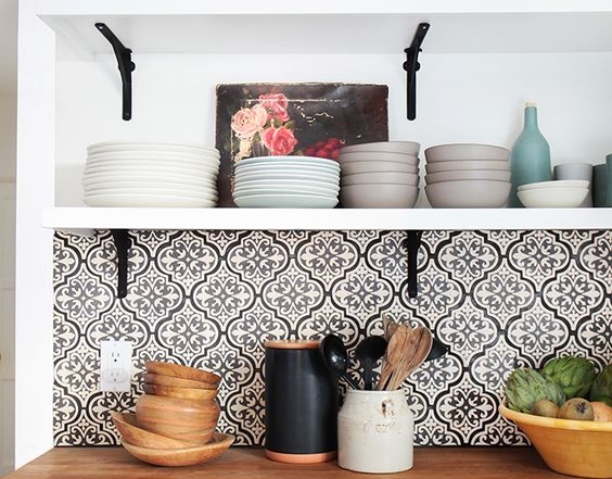
As I was working my way through Pinterest, liking and pinning away, I pulled out some of my favourite kitchen tiles inspiration images, for various reasons, which I’ll take you through now. However, looking at this gallery, it’s clear there’s a bit of a theme/style going on…a) I clearly like blue and b) I like Moroccan/designer patterened tiles…offset with clean-cut metros.
The Tiles
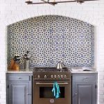
As I posted our kitchen designs, I also shared on my instagram. Within minutes, I had the wonderful Claire comment and give me a fabulous idea…use the chimney breast (that will contain the cooker/hob) as a feature and incorporate those wonderful designer tiles that I seem to like. This would be a great balance and mean we wouldn’t be going overboard.
I’m a bit more daring when it comes to design than my hubby, but I’m also aware that I don’t want to make things too “trendy” or style our kitchen in such a way that it’ll quickly date.
So I think Claire’s idea of pulling in a feature element, would satisfy my slightly more daring designer side, but not be too over-the-top!
Metro Tiles
We installed these in our current home, before the trend for metro tiles had really kicked-in. I’m aware that everyone and their dog now has metros in their homes (and kitchens), but I’m a believer that things are popular for a reason…because they work! I also think, like plain painted walls, they form an awesome backdrop that can be styled-up however you like.
I’d also go white and I’d always go matte with metro tiles in the kitchen, so we’re likely to incorporate these somehow. But I do quite like the contrast of the coloured grouting, so we may opt for a pale grey grouting, to offset the white and pull in the “baltic blue” of the kitchen units and the grey “concrete oak” counter tops.
But I think we’ll definitely choose a more designed, patterned tile for the inset of the chimney breast – this will not only form a design feature, but will also be a practical splash-back for the hob.
Where to tile
I don’t want counter tops to ceiling tiles and budget is also an issue, so we won’t be going overboard with our kitchen tile design. I think instead, we’ll create a row of 6-8 metros up and take it around the the L-shaped kitchen. We’ll then leave the front of the chumney breast without tile and completely tile the inset of the chimney with something more patterned.
We’re likely to have a wooden or laminate floor in the kitchen, so I think the mix of textures and styles will work really well and create that eclectic feel that we love.
What do you think? Any ideas? Please share!
Image sources:
Image source
Image source
Image source
Image source
Image source
Image source
Image source
Image source
